Showing posts with label tips. Show all posts

Monday, May 28, 2012

The beginnings of a drawing

I am a member of the Colored Pencil Artists and Lovers on Facebook and they recently started talking about how to take reference photographs, so I thought I would show you the beginnings of something.

I am starting a new vending machine piece that will be 18" x 24" and have 3 machines, each with a different color fruit. My mom actually told me I should do it and I thought she was right! I only have one bubble gum machine, so I photographed the vending machines separately and will combine them on the board. Just like my other image I want very bright light with just a hint of a shadow and an all white background. I may make it look like it is on a white shelf like Wayne Thiebauld did with his bubble gum machines. As soon as my Mom suggested doing 3 I thought of his painting!


Here is one of the 3 reference photos. There IS side light, but it is subtle. All the colors are very bright. My printer always prints darker than my screen, so I will compensate by setting it lighter in photoshop and upping the color saturation when I print. 


To photograph this type of lighting I have one foam board on the bottom, and one of those tri-fold foam boards kids use for projects in the back (you can spray paint them different colors) turned a little on the lit side to let light in. I have it all set up in my garage with the set up turned to the side, so the light comes in at an angle. The rest of the garage is dark, but gives off plenty of reflected light. You can do the same setup in front of slider doors inside. Its best (I think) to do it on an overcast day or from North light, but you can't ever count on that. If it is terribly bright you can move further into the garage. 

This is just one of the ways I might light/photograph a set up. It is great for high key situations. 


Some other lighting tips can be found here:


Wednesday, September 9, 2009

two ways to pluck a chicken

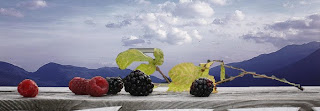
I've always liked still-life because they don't require anything that you can't obtain (especially with the help of Ebay). Unless of course you add something like a landscape behind it like in my Monadnock Berries piece two posts ago. That one I got lucky with. I went blueberry picking with my kids and in the little house you pay at at the farm, they have a balcony overlooking the fields and Mt. Monadnock. I plunked my blueberries and leaves right on that railing, squat down to get the right vantage point, and took several photos. When I went through the photos when I got home, one was perfect for drawing (the one that didn't have Christmas lights in the view).

Now I want to do several more still-lifes with landscapes behind and the berry place I believe is closed for the season. Plus I don't know if they would like me to bring other fruits to photograph on their railing... and I'd like not every one to have Mt. Monadnock behind it.

So this time I bought some raspberries and I believe blackberries from the grocery store, went in the backyard and picked some dying raspberry plant leaves and set up a little still-life on my deck. The view however from my deck isn't so good... the tall trees are just too close. I decided to take some landscape photos for the background, but quickly learned that what worked with the Monadnock Berries was that the landscape was from a high vantage point so I could see the soft blue mountains. So, instead of planning a day hike up a mountain, I went to Flickr and looked up NH hills in the Creative Commons.

Creative Commons provides copyright free or limited copyright of images by normal everyday photographers. Since my composition is just using a portion of the cc photograph, cropped and with other things added, it falls under the guidelines for most creative commons copyright photos.


Original Creative Commons Photograph which happens to be an anonymous photo taken in the 1950's.

& here is the photo reference I will use adding my grocery store raspberries in the foreground. I used Photoshop Elements to add the pictures together very roughly since the drawing will correct any problems. Notice how the original photo looks completely different from the end reference photo?

Now today, as it is my birthday, I thought I would go to Alyson's Orchard since it is high up on a hill and gets just the types of views I like for the background. So I trudged around the orchard and picked the two types of apples available right now complete with leaves, and looked for places to set up a still-life with an instant backdrop like at Monadnock Berries. I brought a piece of wood to set the apples on and placed it on a pole in the ground. Crouched down looking through the viewfinder until I got the correct vantage and snap! no photoshop necessary!

the finished reference photo.
here's the post I set up the still-life on.

Either process works and probably a trip to the farm and going to the grocery store, picking leaves from the backyard, and photoshopping - both probably take the same amount of time. I prefer taking the reference shot on location and not piecing it together, because the lighting always works for the two together and the camera creates some of the soft edges between the foreground elements and background that a pieced photoshopped image won't have. Plus it just seems more authentic.

Thursday, June 4, 2009

How to drop 5-10 years

I haven't finished Pesto yet. I had to frame some things up, deliver to the gallery and get ready for Art Walk in downtown Keene. I am sharing a window with another artist so I just have my piece Zen displayed at Earth Treasures. (Who were so helpful - thank you!). I'll be out there on Friday from 5-8 (give or take a few minutes) to chat and there again on the 10th during the school tours for the kids giving a demonstration.

Now to get to the title of this post - anti-aging. If you or your model have a few wrinkles that you don't want to show, here's how to lessen the look of those wrinkles.

I have this really oooold model I was taking pictures of today... okay its me and I was taking a picture of me in my new glasses to send to my sister back home. I took the first pic in the mirror next to my front door that had side lighting. Side lighting - although I love side lighting for dramatic effects - also makes wrinkles stand out. :-( If you think about it it makes sense - the light is coming from the side and creating a shadow where that wrinkle or crevice is. Sigh... This isn't even harsh light - the light was diffused through the window... so if it were even harsher more intense light, the wrinkles would have been worse.

After uploading that pic on my computer - in an act of true sistership and vanity - I went upstairs to the bathroom mirror where there is more indirect diffuse lighting. The light is more frontal or evenly distributed in the bathroom so the wrinkles don't throw as large of a shadow. Oila - I'm younger!

The light still comes from the side but is slightly more in front of the face than the other photo. The light is also diffused through a shade on the window which helps. Experiment on yourself in different lighting situations and moving the light source to the side and slowly bringing it around to the front of your face. To get a shadow still on the side of the face put the light in front of the face and then slightly turn your head so the light goes slightly off center.

Of course if you wanted more dramatic light like the first pic, you can just paint or draw the wrinkles with less contrast than seen on the model. I always go down a couple of value steps so the wrinkle color is closer in value to the skin color. & I NEVER draw all the wrinkle lines! :-O Since I have the power to leave some out - why not?!

Saturday, May 16, 2009

Black Backgrounds...


I've gotten some "whoas" and some questions about my black backgrounds on my portraits. They really don't take too long despite my whining - about a days work for a really big one like this.

First off I use Polychromos on Fisher 400 paper for my portraits which has its pros and cons. The pencil acts sort of like a semitransparant pastel... where you can both smudge the pencil but the colors will mix together instead of just sit on top of each other for most colors. The con is that it smudges which can be annoying for storage, framing, shipping etc. Sprays don't seem to help much either. 

So for a background like this I'll put down just enough pencil - well scribble it on really. Then I'll use my handy dandy blending tool - my finger - and smudge it all in. Oila it is smooth and has no grain showing. For a black background it doesn't feel much different than using charcoal. 

In the swatch below you can see part of the Shannon background when I had enough pencil down and hadn't smudged it in yet. 


At this moment I noticed I have 99 followers! Wow! Thanks everyone for coming to see my blog!! 

Wednesday, May 13, 2009

Shannon Happy Finished


This is just for scale. I find it weird when you can't tell how big or little something is!


& here is the finished version. Was that background worth all those black pencils I put to rest (3.5  total)? I think so. I think it looks like she was sitting up straight in the middle of the comosition but then relaxed into a more comfortable place a bit off to the side and lower. :-)

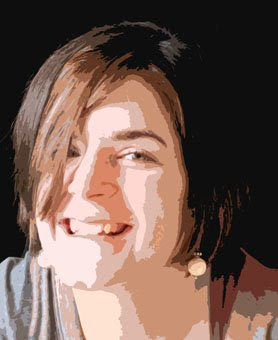
I wanted to show what makes a good reference photo for a portrait. Even in high-key lighting you have to have directional lighting that creates shapes of light and darker areas. Usually with high key lighting that means you have one bright main light source coming at an angle and reflected light coming from the other angle to partially light up the shadowed side of the face. You can see below the photograph I used for Shannon's portrait broken down into its value shapes. Even though the shadowed side is light - its still is there to create the illusion of form.

Of course if the eyes are not lit up then I would also suggest not to use the photo no matter how good the lighting pattern. Although I've seen amazing portraits done of people with their eyes in shadow - most people commissioning a portrait want to see the color of the sitter's eyes. As I see it, usually the light in people's eyes are really lit up as in Shannon's portrait (where you see brilliant color), partially lit (meaning not in shadow but you see a bit of color but not vibrant color), and when eyes are in shadow (usually the eyes sockets are even dark). I don't suggest using a photo where the eyes aren't lit and brightening them up yourself, using the rest of the light pattern on the face. The end result will be confusing - somehow your mind knows the lighting isn't right. I would just take another photo (no matter how inconveniet) with the light right to hit the eyes. Practice on yourself  with a mirror and a table lamp with the shade taken off to figure out where a good place to place the light to light up the eyes right as well as  a good value pattern. 


Friday, March 27, 2009

hair - info not covered in workshop

For those of you that were at my workshops... I didn't discuss the topic of rendering hair. Actually I very conveniently chose a reference photo that didn't have any hair showing! :-O

OK colors for the hair underpainting... are not the same as the flesh colors (unless they have rosy colored hair - oh my). What I do is choose colors I see in the reference and try and use one or  two or three  colors from the flesh toned underpainting palette. So maybe with a sandyblond hair - I might use burnt umber, a sandy brown color, cinnamon, and a yellow ochre. The more colors I can use from that flesh palette the better - for color harmony. 

Here's some samples below. I tried to figure out what colors I used... because I didn't have them written down.


This is an example of dark hair.. that when lit by a warm light has a lot of red tones. So I was able to use burnt umber and Pompeiian Red in the colors. To which I added a greenish brown and some soft blue highlights.

This is ummmm my hair which is that ash color. I managed to get burnt umber in there... and then made sure I used some cinnamon in some highlighted areas in the later stages.
This hair is a strawberry color so it was easy to get my underpainting colors in! I left out the Pompeiian Red in Place of an orangey-er color.
This last one has some burnt umber, cinnamon and ivory in it... but again the Pompeiian Red was replaced with a golden brown color. I think I galzed some greenish color in areas as well.


Wednesday, April 2, 2008

3 Methods of Watercolor pencil/crayon Underpaintings

EDIT: I've had an epiphany and have figured out what I wasn't liking about watercolor pencils/crayons under dry but couldn't pinpoint! Its on my next post coming up! I'll link it here when I finish writing it.

First off, I did decide to cut apart my triptych, and I do like it much better this way. I will be doing the one larger, but i have to wait until I have other things to order before I get my big board to save on shipping.

I promised to give my opinions and experience of using watercolor pencils/crayons underneath dry colored pencil.

I tried underpaintings in a few different ways. On this last abstract bag duo, I did very simple shapes of color underneath dry colored pencil on tan board. I chose the lightest color I saw in each plane of the bag so when I added dark pencil on top the lighter color showed through and gave a glow to the overall piece. I also added white watercolor crayon underneath the boldly lit areas.

This method worked very well, and the light effects of it are spectacular with the light catching those lighter colors underneath. Plus you just can not get that bright of a white with dry pencil on pastelbord - the watercolor white really helped lighten it up.

I used Neocolor II watersoluable crayons which can easily be made to cover large spaces quickly. The fact that a little goes a long way is very desireable if working on a big piece.

In these bag drawings I deliberately did not do any details at all with the watercolor crayons - just very simple blocked in colors all over the board. I didn't try and smooth the dry pencil out on top of the neocolor because I didn't want to lose the feeling of the color coming through and the optical mixing that would get lost if I blended things in with dry pencil.


So pros of this method I would say are:

  • great light effects
  • can achieve wonderful saturated color
  • can achieve the "glow" effect by layering light colors first
  • can achieve very bright whites (not attainable with dry pencil on colored board alone)
  • Texture has character
  • Texture allows Optical Mixing of colors and the light colors to shine through
  • the watercolor fills in the tooth so you don't get the color of the board coming through and can achieve darks darks and lighter lights
Cons:
  • Texture is not smooth, which is sometimes ideal with realism
  • Is a whole different experience than sitting leisurely with dry pencils
  • Short drying time added in

& now a look at a couple of other ways I've used watercolor underpaintings:

This piece was done with Caran D'Ache Spectracolors underneath dry Luminance and Pablo pencils on WHITE Pastelbord.

This again worked very well. I wanted to achieve the look of the transparent glass and the watercolor pencils really helped me achieve that.

On this one I did a more detailed watercolor pencil underpaintings and then used the dry pencils to smooth things out and to "fix up" areas that got away from me with the wet media.

The part I didn't like with the watercolor panting on this one was that it made rendering the paper a little more difficult. Maybe because I have done paper so many times with dry pencil, but I felt like it was a struggle instead of a smooth experience. The glass on the other hand was BLISS! The colored pencils smoothed things out wonderfully if I wanted them to, but lost the optical mixing that I achieved in the last images of the lit bags.


ANOTHER experiment:


This one was done with a very finished Spectracolor underpaitning on white board. The Spectracolor pencils have white in them to tint the different colors ( to get pinks, light greys etc) instead of relying on the amount of water mixed with the pencil. I think this is common with watercolor pencils. What that means however, is if you do an underpainting using a variety of tints and shades of a color, then you will not get a transparent watercolor look, but a look more like gauche. At first I didn't like this effect, but the more I look at it, the more I like it.

I think I would like to try more with this method - I mean look at that chalky blue bottle!

Friday, November 16, 2007

Disaster!

You won't believe me when I tell you what I did... its something that was so stupid, that it can't be true.

Well, the pretty portrait of my daughter Lizzy... is no more. I sprayed it with two coats of my usual Lascaux fixative and then used my new Lascaux brush on varnish on it... and it picked up the colored pencil and redistributed it with every brushstroke. It made me sick to my stomach to see it wrecked like that.... so I had to redo it. :-(
The one on the left is the wrecked one. It is darker because the pencil from the dark areas are now spread around, plus you can see the brush strokes where the pigments huddled together.

So yes the one on the right is the beginning of the redo. I was heartbroken and hoped I could replicate it. I find redoing a picture I was happy with very very hard to do. Instead of doing things in order I jump to what I know I did before and forget some important steps.

Well here is the finished do-over. Remember when a do-over was a good thing... something you begged to be able to do??? I hope this one doesn't disappoint.