

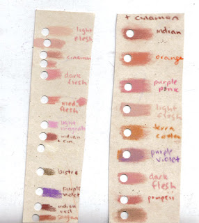
These little test strips are such a helpful tool. First I took all my favorite skintone colors from my polychromos and scribbled them on some Fisher 400 paper and punched a hole in the middle of them. Next I took what I felt was the closest color to the base color of her face - basically that is what color I would pick if I could only choose one color - and I made a second tool from them. This time I scribbled the base color, in this case cinnamon, and mixed it with colors I thought would make good skintones and again punched a hole in those mixtures. Since I am working with a photograph I can place the tool right on top of the photograph and match up colors. With such a limited range in values on the sunlit face, these tools are really priceless.
1) I have found that while using the Ampersand pastelbord – and maybe one
shouldn’t do this – that I can layer colors or change my mind about an area I’m
working on without end (although I know there must be an end) so long as I can,
from time to time, use a solvent to blend and create a new surface. I hope you
are not wincing. I also found I can veer far, far away from using the beautiful
shaded tiny circles or straight line stroke techniques I’ve seen demonstrated
and (enjoy using on paper) and just unabashedly scribble away (gasp) in those
less realistic areas. Is this because I know nothing and should not do this, or
is this what pastelbord allows and forgives me for?
2) Given that not all the areas in my pastelbord pieces reveal a
solvent-finished surface after the last stroke, the surface sheen is uneven. Is
this why one applies the varnish? Do you always use fixative on all your pieces,
Nicole?Thanks to you and all for your patience with these questions. This is
what comes
Vicki - first off there is no one way to work and I would never say any
method is worng if it works for you. I don't like to use solvent myself, but
my friend Maggie Stiefvater I believe works in the same way you are
describing.
2nd question - I apply varnish because I frame without glass and want to
protect the piee from dirt etc, and allow the owner to wipe it clean. The
fact that it does even out the finish is a bonus! I always use fixative and
varnish for all my pieces on pastelbord and use fixative on my pieces on
Fisher 400.
7 comments:
This is coming along great, Nicole!
I just wanted to pipe up and say -- yeah, when I put fixative on my pieces that have solvent and non-solvent areas, it evens it all up nicely.
I love this already. What a beautiful girl.
I am so grateful! Thank you, Nicole and Maggie, for sharing your finishing touches. I love the life within each of your unique and beautiful styles; it truly mesmerizes me whether it’s the serenity and depth in your portraits, Nicole, and the delight and expansiveness of life in Maggie’s. It’s the life in your work that makes looking at it all so inspiring. Everyone’s got a definition of what art is and mine is “to give life” Isn’t colored pencil great for allowing us to capture so much life? Life’s simple, but complexly simply, more than the eye first sees - just your test strip samples! These are priceless to behold. Thank you for sharing them and inspiring – giving life –to me and my illustrating.
Amazing work! I love how your test strip idea and to match the colours to the photograph!
Beautiful, Nicole! I didn't realize you used Polychomos for your skin tones. Do you use them most of the time instead of Prisma's?
Debbie Duffield
Thanks everyone!
Your Welcome Vicki!
Debbie - I use my polychromos whenever I use Fisher 400 paper. They smudge real easily and are almost like a thin pastel pencil, which I really enjoy. When I work on pastelbord I use Derwent Coloursofts, Luminance and the occasional Prisma. I don't use my prismas very often actually.
Nicole, This portrait is beautiful! Can't wait to see the 'beachy-ness' of it. Love the idea of the tst strip - genius.
Post a Comment