Monday, June 22, 2009

& the Dish Ran Away with the Spoon


& the Dish Ran Away with the Spoon
well that's the title anyway. :-)

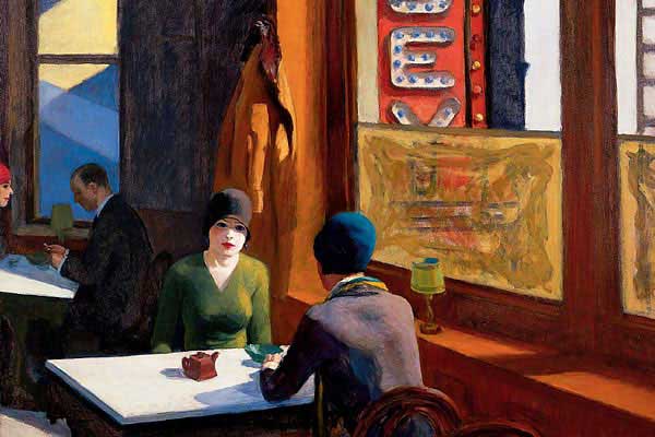
This was a lot of fun... albeit time consuming for such a small piece. There is so much going on in that little square. I almost think it doesn't work, its so busy... but hopefully I managed to pull it together by lumping values together (sort of like Hopper did) and simplifying where needed. I think you can see what I mean more in the .jpg below where I used the cutout function in Photoshop Elements to lump the major value shapes in the piece. I used the shadow down the center of the cloth as a dark shape leading the eye up and framing around the coffee cup... which actually mimics that long black shape in Hopper's Chop Suey picture on the table.

One of the most fun things about this was getting to know Hopper's painting better. He used objects, color shapes etc pointing this way and that all over the picture, which I tried to mimic in my drawing. Other things I mimicked was the writing on the cup with the sign in the painting, and the resting areas of the white of the table. I'm sure there's more - and you can let me know!

I had to change the Hopper painting a little. The Chop Suey painting has two focal points - the women in front and the couple in the back... well when you add my focal point of the coffee cup and spoon - that's just way too many focal points... so I decided to fade in the couple in the back of the Hopper painting instead of having them stand out... the same thing for the big yellow square next to the girls on the right... I just made it stand out a little less to keep the focus on the girls.

& I just got back from getting a nifty matt cut around the corner at Creative Encounters so when it is at the Silent Auction (during the CPSA Convention) it will look nice and tidy. They helped me pick a matt and showed me this green core black matt... which seemed to work. It didn't occur to me until I got back from the studio how the green core really made the green lines on the cup and saucer really work!


Wednesday is the last day of school for the kids which means my studio will stay mostly empty for a while. If anyone want to see/reach me just email me and I can come in. As far as blog posts go... they will be fewer and farther in between probably for the summer and may include more sketches (from our trip to Maui we are taking in July), but don't worry I'll be back in full force in the fall for sure... and will be here. If you haven't subscribed or "followed" me yet nows the time to signup so you won't miss when I start posting more again.

Thursday, June 18, 2009

I love coffee... and I love Hopper...

Sorry I haven't been around... first I had a funk and couldn't get motivated... and then my laptop went kerplunk... I am having difficulty taking photos etc without my laptop since this old computer of mine has so many broken ports.

Anyway you don't want to hear about that!


\I finished my Pesto... and don't like it much. Maybe part of the funk? Its just too static. Funny though, someone stopped in about me doing a website for him and out of alllll the pictures in my studio that is the one he commented on liking. Lesson learned... I'm going ot not look at it for a while and see if I like it better later.


Right now I am working on a 7.5 x 7.5" little still-life for the silent auction at the CPSA convention in Atlanta. I decided to do something funky and off kilter, after not liking the pesto so lined up. I took a Hopper picture and made a still-life around it - something I've done a couple of times before and really enjoy doing. Its kind of my version of Karin Jurick's gallery pieces. This will be a busy little piece with so much going on - so its taking me a while. Look at the Hopper though - this piece by Hopper is busy as well... but look at that large black shape that connects the background, people etc. Its genius! My piece btw is on UART 400 paper - using coloursofts and Luminance... which I use in my classes all the time.


All the proceeds from the silent auction benefits the National CPSA and all pieces involved will be posted on their website in the near future. I'll let you know when they are.

Back to work for me! The kids only have 5 days of school left - I better get busy before I have to be home (or at the beach) with them!

Tuesday, June 9, 2009

Ann Kullberg's new book!

Ann Kullberg has a great new book out called "Colored Pencil Secrets for Success" published by Northlight. It is a cool concept in itself. On her emagazine, Ann critiques somebody's work every month and is great at it (something I am working on myself!) so this book is kind of a continuation of that. She takes several drawings submitted to her and crits them. I really believe this is a great way to learn about art instead of following a bunch of rules - its like seeing art in action.

The surprising bit though is that Ann asked to have my work included in the "Still-Life Secrets Showcase" and said the nicest things about my work as well as printed it there for all to see. I have to admit I had trouble opening the book because I know that Pastelbord DOES NOT print well - the grain shows up so loud in printing - but when I got past that and read what Ann wrote about my work, I am very, very proud. :-)

here's a bit of what she wrote:
"Nicole Caulfield is a New Hampshire artist and a rapidly rising star in the colored pencil world. She is best known for her work on sanded surfaces, which give her images a distinct painterly look, but she is constantly experimenting with new supports."

&
"I have been a huge fan of Nicole's from the first time I laid eyes on her work. She seems to have unerring drafting skills and always handles aspects like concept, composition, color and shape with ease, grace and beauty."

Thanks so much Ann! You are an inspiration to me and including me in your book was a great honor! :-)

You all can purchase a book through Ann's site.

The winners of my hole-y giveaway - I finally sent them yesterday except to the person who hasn't given me their address yet! :-) Send it to me and I'll get the cherries out to you.

Thursday, June 4, 2009

How to drop 5-10 years

I haven't finished Pesto yet. I had to frame some things up, deliver to the gallery and get ready for Art Walk in downtown Keene. I am sharing a window with another artist so I just have my piece Zen displayed at Earth Treasures. (Who were so helpful - thank you!). I'll be out there on Friday from 5-8 (give or take a few minutes) to chat and there again on the 10th during the school tours for the kids giving a demonstration.

Now to get to the title of this post - anti-aging. If you or your model have a few wrinkles that you don't want to show, here's how to lessen the look of those wrinkles.

I have this really oooold model I was taking pictures of today... okay its me and I was taking a picture of me in my new glasses to send to my sister back home. I took the first pic in the mirror next to my front door that had side lighting. Side lighting - although I love side lighting for dramatic effects - also makes wrinkles stand out. :-( If you think about it it makes sense - the light is coming from the side and creating a shadow where that wrinkle or crevice is. Sigh... This isn't even harsh light - the light was diffused through the window... so if it were even harsher more intense light, the wrinkles would have been worse.

After uploading that pic on my computer - in an act of true sistership and vanity - I went upstairs to the bathroom mirror where there is more indirect diffuse lighting. The light is more frontal or evenly distributed in the bathroom so the wrinkles don't throw as large of a shadow. Oila - I'm younger!

The light still comes from the side but is slightly more in front of the face than the other photo. The light is also diffused through a shade on the window which helps. Experiment on yourself in different lighting situations and moving the light source to the side and slowly bringing it around to the front of your face. To get a shadow still on the side of the face put the light in front of the face and then slightly turn your head so the light goes slightly off center.

Of course if you wanted more dramatic light like the first pic, you can just paint or draw the wrinkles with less contrast than seen on the model. I always go down a couple of value steps so the wrinkle color is closer in value to the skin color. & I NEVER draw all the wrinkle lines! :-O Since I have the power to leave some out - why not?!