Thursday, May 28, 2009

Pesto! wip


As I've mentioned before I am culinarily deficient. Yes spellcheck doesn't like that word - but it seems appropriate. I do, however, grow basil outside every year so I can make a couple of big batches of pesto sauce. mmmmmmmm..... Its one of the few things that I think is worth all the watering and caring for that gardening entails, let alone the making of the sauce. I have a mini food processor that is dedicated just to Pesto. :-)

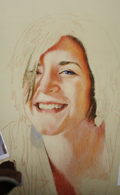
This is small... I usually work life-size but I printed out the reference at about 8 x 12" and really liked the way it looked at that size. The clincher was when I found a piece of scrap Pastelbord just that size in my stacks. In this recession you can't waste any cut offs! :-) You can see the ragged edge where I scored and snapped off the Pastelbord. I could sand that off but it won't be noticeable under the frame edge. Of course this odd sized piece of Pastelbord will need a custom cut frame. Sigh. 

I'm using Polychromos on the Pastelbord so far. I forgot that I even tried Polychromos on Pastelbord and liked it until I found this old post about it.  I like them on the board but I do think it tightens me up since the pencils are harder and keep a sharper point. Of course I only use polychromo for my portrait but they act differently on Fisher 400 paper (the paper I use for my portraits).

Hopefully I will get this finished tomorrow. I have a new portrait to start next! 


Wednesday, May 27, 2009

framing


I've just spent today making frame orders for my artwork and feeling like I was really unproductive. Measuring artwork and ordering frames is never as much fun as making artwork, but I really need to get my latest still-lifes off to the gallery so I HAD to make a frame order. They are doing me no good sitting here frameless

I thought I'd show you all the frames I get. I usually get the "plein aire" frames, which I guess are supposed to be for outdoor landscapes? I just really like how they are very wide and almost like a double frame, but simple in style. The top one is white and is a special order from pictureframes.com. They have all different colors now but I usually buy them in black for my still-lifes and gold for my portraits, but obviously I don't always! You can see the gold frame in the portrait below. the gold is a bit brassy. There is another gold with a crackle that I have bought and really like - the finish is much less brassy and shiny but it is not in my studio at the moment. It was also from pictureframes.com.

I love framing the pieces on paper (my portraits) with museum glass - BUT it is way too expensive, so I usually just order the plexi from pictureframes.com. I hate the glare but that is what you get if you don't want to pay for museum glass

You'll also notice that I don't use matting even though they are on paper and under glass. I found that when I frame them with matting it is much more expensive (larger frame and glass to allow for the matting plus the price of the matt). They also look better hung next to my still-lifes on board that I frame without glass. So what do I use so the art doesn't touch the glass? I use spacers... and there are many types. The ones I use are from artright.com and instead of sticking them on the glass like a sticker - they clip over the glass. Admittedly when you are using real glass it is a scary procedure, but with plexi it isn't so bad. They come in loads of sizes to hold the glass further away or closer. 

When I am working in a standard size, which isn't often, I order plein aire frames from Dick Blick They are so much cheaper, but only come in standard sizes. You can see the one I ordered from Dick Blick on the still-life with apples. They might be cheaper than at pictureframes.com but they are of lesser quality. They are made from a much softer wood and then painted and can get dents, scratches etc much easier than the others. 

Now hopefully my order will come in soon so I can frame this stuff up and get it out at the galleries where they belong!


3 pieces waiting for frames... Shannon looks like she's a bit tired of waiting...

Tuesday, May 26, 2009

Giveaway!! & I've gone Etsy on you!


So I had this fabulous idea to take my workshop demonstrations and sell them on Etsy at low prices compared to my regular drawings. So I took them down from the display board in the hallway outside my studio (where I've had them hung), took them home to scan and make an Etsy shop during the holiday weekend, and found BULLET holes in them! Okay not bullet holes, but when scanned in and enlarged it looks like it. It seems that somebody felt the need to poke pushpin holes in my drawings. :-( A couple came away unscathed and I have put those on my new Etsy shop: www.caulfield.etsy.com

As far as the hole-y drawings? The holes aren't actually so noticeable (unless you scan them or hold them up to light) so I've decided to do a giveaway! 

The first 3 people to comment in this thread that they want one will get one of the three little drawings above! Enlarge the photos to see the holes... maybe you don't want one!


I'll try and put some things in there from time to time. The prices of the workshop demonstrations will be lower that my normal drawings which are set at my normal gallery prices even in the etsy shop. There may be a discount however for unframed pieces. & you know - you can always go to one of the galleries I'm in and buy over the phone a piece that you've seen on this website. Currently I have work at these galleries:

Monadnock Fine Art Gallery 99 Main St, Keene, NH

Chasen Galleries -
3554 W. CARY ST RICHMOND, VA
2850 SELWYN AV CHARLOTTE, NC

Sharon Arts Juried Gallery in downtown Peterborough, NH


Thursday, May 21, 2009

Titles ARE Important

This is one of those blog posts I thought of while jogging... and I may decide it wasn't a good idea later. It of course has to do with running and art. 

For a few years now I've been jogging, but I never thought of myself as a runner. A runner is one of those people who run marathons and break records. Recently however, I've been pushing myself to get stronger with running by setting myself some goals to meet instead of just the 40 minute jog I used to do nearly every morning. Its been working, each week I'm stronger and can get further or faster. Something happened along the way too though - somewhere along the way I started thinking of myself as a runner. 

A runner?

I was always the one that would sit and watch others run... and would argue with the gym teacher in high school that not everyone is built to run a mile. I'm a runner?

I'm a runner because I look forward to running and I look forward to getting better at running. I'm a runner because if I skip a run I miss it. I'm a runner because when I see someone jogging outside while I'm driving in my car I wish I were them. I feel like a runner. 

The first time you use your new title (runner) (artist) it feels funny but it also feels liberating. I remember once when  someone asked me what I "was" and I blurted out "ARTIST" without thinking about it and how liberating it felt. I had always said "stay at home mom" or whatever before... but something in me at that time thought of herself as an "artist" instead. 

I wasn't selling much art back then, but that doesn't matter. Being able to call yourself an "artist" isn't about whether or not you can pay the mortgage from it. Its about who you are. Being an artist is about wanting to work hard at getting better and better. Its about missing drawing or painting when you can't do it. Its about getting an idea for a painting while eating a hot dog. Its about feeling like you are an ARTIST. 

Once you give yourself your new title it doesn't mean you can slack though - it means you have to work even harder to keep that title. 

I'm a Wife, Mom, Artist, Runner and a lousy cook - how about you? 


This is what I'm working on now... its almost finished. 

Another 8 x 10" but on green pastelbord


Wednesday, May 20, 2009

Pear Halves


Here it is finished. Pear Halves, 8" x 10" Luminance & Coloursofts on Grey Pastelbord

I say finished but I really really want to try using a heat gun on it. I saw an article about this technique in Ann Kullberg's e-zine and I think it might just work on the Pastelbord to help fill in the dots... or it may make a huge mess. The point would be for the heat gun to heat up the wax based pencil and let them melt just a bit. Hmmmmm you may see this again or I may chicken out!

& I have to show off my new little drafting table (below) that I got for $20 at the Creative Encounter's Frame Shop basement sale! Yay! (Love that place and all the women who work there!). Its short so I've gotten an exercise ball for a chair... which certainly gave me some exercise blowing it up with the little hand pump that came with it. The hand pump is staying in the studio - it works great for clearing the shavings off my work!

Tuesday, May 19, 2009

New 8 x 10 still-life

I just started another 8x10 still-life. I'm using Coloursofts and Luminance pencils on grey Pastelbord. 

I'm going to try and pump out a few 8 x 10's. Wish me luck. 

Saturday, May 16, 2009

Black Backgrounds...


I've gotten some "whoas" and some questions about my black backgrounds on my portraits. They really don't take too long despite my whining - about a days work for a really big one like this.

First off I use Polychromos on Fisher 400 paper for my portraits which has its pros and cons. The pencil acts sort of like a semitransparant pastel... where you can both smudge the pencil but the colors will mix together instead of just sit on top of each other for most colors. The con is that it smudges which can be annoying for storage, framing, shipping etc. Sprays don't seem to help much either. 

So for a background like this I'll put down just enough pencil - well scribble it on really. Then I'll use my handy dandy blending tool - my finger - and smudge it all in. Oila it is smooth and has no grain showing. For a black background it doesn't feel much different than using charcoal. 

In the swatch below you can see part of the Shannon background when I had enough pencil down and hadn't smudged it in yet. 


At this moment I noticed I have 99 followers! Wow! Thanks everyone for coming to see my blog!! 

Wednesday, May 13, 2009

Shannon Happy Finished


This is just for scale. I find it weird when you can't tell how big or little something is!


& here is the finished version. Was that background worth all those black pencils I put to rest (3.5  total)? I think so. I think it looks like she was sitting up straight in the middle of the comosition but then relaxed into a more comfortable place a bit off to the side and lower. :-)

I wanted to show what makes a good reference photo for a portrait. Even in high-key lighting you have to have directional lighting that creates shapes of light and darker areas. Usually with high key lighting that means you have one bright main light source coming at an angle and reflected light coming from the other angle to partially light up the shadowed side of the face. You can see below the photograph I used for Shannon's portrait broken down into its value shapes. Even though the shadowed side is light - its still is there to create the illusion of form.

Of course if the eyes are not lit up then I would also suggest not to use the photo no matter how good the lighting pattern. Although I've seen amazing portraits done of people with their eyes in shadow - most people commissioning a portrait want to see the color of the sitter's eyes. As I see it, usually the light in people's eyes are really lit up as in Shannon's portrait (where you see brilliant color), partially lit (meaning not in shadow but you see a bit of color but not vibrant color), and when eyes are in shadow (usually the eyes sockets are even dark). I don't suggest using a photo where the eyes aren't lit and brightening them up yourself, using the rest of the light pattern on the face. The end result will be confusing - somehow your mind knows the lighting isn't right. I would just take another photo (no matter how inconveniet) with the light right to hit the eyes. Practice on yourself  with a mirror and a table lamp with the shade taken off to figure out where a good place to place the light to light up the eyes right as well as  a good value pattern. 


Tuesday, May 12, 2009

Shannon Happy - 2


Help Wanted: Will pay  small amount of $$ for someone to fill in the rest of the background black using a riduculously small rendering instrument...

The portrait of Shannon doing a back bend... The Fisher 400 paper came in a roll... need I say more? Note the use of tape in the other photograph. 

I didn't change much on the face except for adding a bit of orange on the shaded side of her face. Mostly I worked on her shirt today, but I also added some colors into her hair. Click on it to see it larger. 

I started a still-life but not enough was done on it to post. I will soon!

Monday, May 11, 2009


I did a dramatic portrait of Shannon a while back. Dramatic lighting, pose and emotions... That was my intention when doing the portrait and reference photo shoot, but one of the last shots I took of Shannon was so relaxed and "real" I just have to do another of her. Also her mom saw the other posted on my blog and though she was depressed! So this one will prove that she wasn't. 

I was hesitant to use this reference because she is smiling. I don't know if you've noticed but most artists do not draw/paint their subjects smiling. There are several reasons for this most likely because when people smile their eyes are not wide open. The other big reason is because teeth aren't the most fun thing to paint, lol

I felt like Shannon's eyes were open just wide enough for this to be a good portrait. Plus the lighting hit her eyes so perfectly that the colors sing. 

I'm going to start another still-life tomorrow and try and work on this and the still-life simultaneously... something I don't usually do, but I need to make some morestill-lifes and I can't leave much time between portraits! 

Thursday, May 7, 2009

Keene Art Stroll Today!


I will be part of the Keene Art Stroll today from 5-7.

Keene Art Stroll is Keene's answer to gallery night.  Pick up a flier in businesses downtown or in yesterday's Spotlight section of the Sentinel. It lists all the shops downtown that have artwork displayed, a map,  and regular hours you can see artwork during the month. Read about it here in the Keene Sentinel

My artwork will be in 3 locations for art stroll:

1. First and foremost at the Monadnock Fine Art Gallery, 99 Main Street. Mary Iselin is the featured artist of the month but my work is always there as well as many other  artists. The gallery is such an inviting space and is filled with a variety of artwork and styles - the biggest bang for the buck in Art Stroll. At the gallery you can see one of my newest pieces "Spring Flowers" as well as my infamous Obama portrait and other still-lifes. 

2. I have a small show along with Brian Jenkins at Primeroast further down Main Street. This is the first time I've seen Brian's still-lifes in person and they are fabulous. Actually his website does not do them justice at all. I have 8 pieces there including my portrait Zen and others. 

3. Lastly, I am opening up my studio at 17 Roxbury Street (down the hall from Mom's Tattoos) where I work and teach classes and workshops. Come by and chat with me and see some works in progress and the tools of the trade. 

This is the second Art Stroll which is likely to become a monthly event; next month excluded for our annual Art Walk. I am the only artist opening their studio during the stroll, but hopefully other artists with downtown studios will jump on board in later strolls. 

pears finished


Finished. I wish I would have done it on a darker board, because the little light tan specks are showing a bit too much.

golden pears and regal grapes...


I decided to do one of the still-lifes that I showed the reference for in a previous post. I wasn't too happy with the composition at first but after letting it sit for a while I've decided I really like it (another good reason to work from photographs). 

I always have trouble coming up with good 8 x 10 compositions that aren't stiff and feel like they follow some pattern on a Mondrian painting, but this composition seems to work. What I like about it is how everything isn't lined up and perpendicular to each other. The bowl of grapes has a handle that breaks that by having it angled as well as the diagonal line the green cloth and grapes themselves make in the upper left corner. I think this is a setup I can explore more in other compositions. 


Tuesday, May 5, 2009

Shiver Finished & CPSA

I'm calling Shiver FINISHED. :-)  

For those of you who didn't see the first post on it - Its an illustration of the character in Maggie Stiefvater's book Shiver about a girl who falls in love with a wolf. It is set in Minnesota winter and the cold is a big concept in the book so I wanted it to look cold, foggy, and shivery lol. She is supposed to look somewhat sad in this and like she is looking for her lost love... Its not going to be on the book or anything - I just loved the book and thought it would make a great picture.  Its a large piece because I don't like working much smaller than life-size - the final is 24" x 32." 

It was so much fun starting with a set character that I may just do this again with another book character! Maggie - what are writing about next?! Hmmmm maybe I should do a pic of James with all that writing on his arms....

Here's Maggie post about it on her Live-Journal http://m-stiefvater.livejournal.com/104720.html

& some good news:


I'm happy to announce that my piece Becca was accepted into this years International Colored Pencil Society Show in Atlanta Georgia!
Yay Becca! Here's an old thread on that piece http://nicolecaulfieldfineart.blogspot.com/2008/10/untitled.html


Monday, May 4, 2009

Spring Flowers - Finishing it up and spraying it

a good reason to work from photographs

I've finished up the spring flowers. The last step I did was use a drybrush to really soften some edges where I felt like sharp edges  would keep the focus away from where I wanted it - mostly on the left side. I also didn't put as many details in the vase, particularly the foot of the vase, so the attention would stay up at the flowers. 

I've gotten a lot of questions about what the varnish does to the colored pencil colors so I decided to put below the drawing not sprayed (above) and sprayed (below). The varnish spray intensifies the darks, which I usually find is a good thing. Sometimes it will also darken a color I want clean and bright - like my yellow flowers. What I believe it is doing is making the pencil more transparent and allowing more grey board to show through. If it darkens the light colors too much, I'll let the first coat of varnish dry and apply more yellow colored pencil, then finish spraying the piece. 


Saturday, May 2, 2009

Spring Flowers WIP 3


A little update from yesterday! I had to put the background in so I could do the glass. Without the background its hard to figure out what color to make showing through the glass. 

Have a nice weekend!

Friday, May 1, 2009

Spring Flowers WIP 2

click to enlarge

I worked on this for HOURS yesterday and see little progress! Flowers are complex - especially when you bunch them all together. :-) The hard parts are finished really so the rest should not take quite so long. When I left the studio yesterday I wasn't sure I liked it. I think partially from the chair I was sitting on while working being way too tall for my work table. I was hunched over the drawing, my back ached and my eyes couldn't focus by the end of the day. Ahh maybe it wasn't the chair - maybe I was just grumpy, lol. Anyway with fresh eyes this morning I like it!

For most colored pencil artists we are told to "push our darks" because it takes layer after layer to build up strong darks. While working on colored paper however, not only do we have to push our darks we have to push our lights as well. Our eyes can see thousands of values in the real world, but it is impossible to have that many stages of values in our drawing or paintings. One way to overcome this obstacle is to make the lights lighter on the one extreme of your value scale and the darks darker - essentially elongating the value scale. 

When working on colored supports, we already have to overcome that darker value of the paper, so adding in lighter colors (or colors with white in them) is a great way to brighten them up. For instance if I want a medium valued red I would use a medium red, add some pink over the top and then medium red again -- essentially sandwiching some white in for the light to bounce off of in between the layers of red. Of course if you want a dark color you wouldn't want to add any white in between layers. Adding  white in the lighter colors and not in the darker colors makes the lighter colors pop out and the darker colors sink in. Sometimes I will use white to do this but usually I use a color that contains white because white is the waxiest color and hard to work on top of.